Wednesday, November 6, 2013

Huxtables, past and present, Take on Boston City Hall

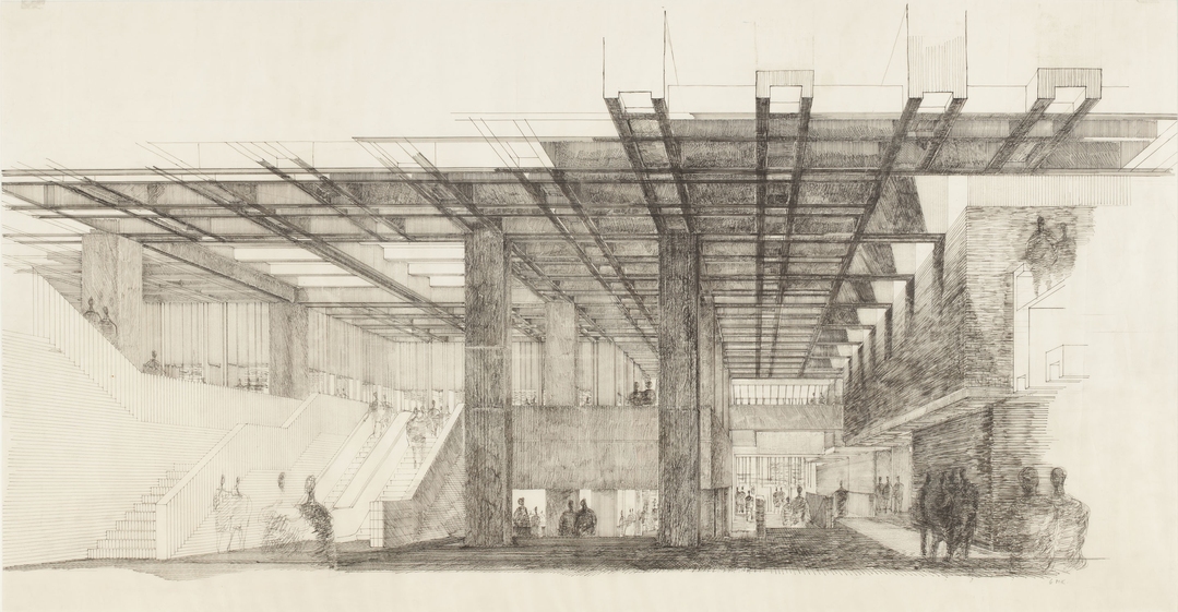
Boston City Hall, Perspective Looking North, Second Floor North Hall, by Gerhard M Kallmann. Image courtesy of Historic New England.

This October, the Huxtable fellows went to the Boston Society of Architects gallery space to see an exhibit of original drawings of Boston City Hall. It seemed serendipitous that we had the opportunity to see this collection, since on our very first meeting in September, in talking about our group's namesake, Ada Louise Huxtable, we had discussed her praise of the Boston City Hall design. Huxtable was the architectural critic for the New York Times from 1963-1982, and her writing style is marked by her sharp wit and humor and her popular column had a powerful impact on public opinion. She championed the importance and relevance of architecture to the every-day person. Many of her most famous pieces of writing were take-down pieces, wherein she eviscerates the unfortunate architects whose designs did not meet her standards. She insisted that we care as much about bad architecture as we do about the good, because the built environment far too important to be left either to chance, fashion, or a false perception of irrelevance.

Boston City Hall, even today, is a much reviled building. It frequently appears in online lists of the ugliest buildings of the world. Ask anyone in Boston, they either love it, or they hate it.

Ada Louise Huxtable flat-out loved it. She praised the Brutalist icon calling it "one of the handsomest buildings around, and thus far, one of the least understood." She proclaimed, "Boston can celebrate with the knowledge that it has produced a superior public building in an age that values cheapness over quality as a form of public virtue."

What she admired most in the buildings design was its magnificent monumentality, its radical difference from Boston's traditional architectural conservatism, but also importantly the attention paid to the experience of the visitor. This latter quality was startlingly revealed in seeing these original drawings. In viewing the drawings you can see how in the original design the ground floor of the building was entirely open, bringing the plaza into the building and allowing the free passage of Bostonians through the building towards Fanieul Hall. Inside, views of the city: the waterfront, Fanieul Hall, and Quincy Market, are framed by protruding deep concrete modular windows -- a design feature whose conception is evident even in the earliest sketches of the project. As visitors stood in the center of the space, great voids within the interior would allow them to see up into the various departments, allowing for a literal transparency into the workings of a city government infamous for its corruption and back room dealings. I was struck by how markedly different this vision was from the current experience of the building is -- nowadays if you wanted to make your way into the center of the building you would have to move through not one but two security checkpoints, the ground floor is entirely enclosed -- the building obstructs the landscape rather than incorporating it. This building serves as evidence of what a different world we live in today than what must have been in the 1960s, where radical openness and transparency could be made part of a major civic building. It's hard for me to imagine anything like it being built today.

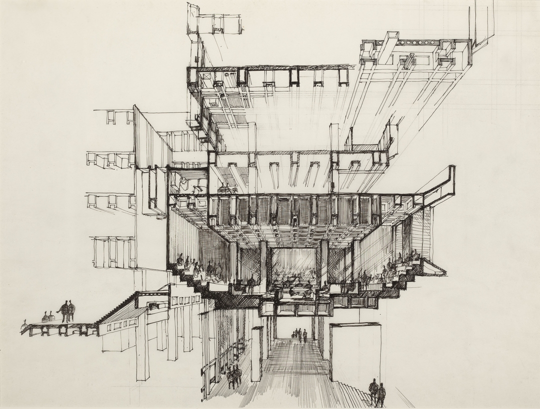
First Sketch – Site Section Looking North. Gerhard M. Kallmann and Michael McKinnell.
The collections of drawings were curated and exhibited by Historic New England, of which McKinnell himself is a chairman, so you could effectively argue that he himself assembled his own best drawings for this exhibit. They present themselves in a clear secession of consistent design conceptions, relatively unaltered by iteration. As if the genius architect had the idea plop down straight from his mind onto the paper, and never needed to alter it -- any working designer knows this is not really possible, but this remains the presented narrative. It is my opinion that the exhibition would have benefited from showing an assortment of the ideas and sketches that were not incorporated into the design, not only to be more truthful in its depiction of the design process but also so that we, the audience, could look at them and wonder: what if? Nonetheless, the drawings that are exhibited are gorgeous, striking, and virtuosic, especially in the pen and ink media.

To critique the critic and the exhibit further: Huxtable in her praise of the of the building, and the exhibition in its pristine presentation, both neglected to fully address the political context of the project. In the 1960s wide-sweeping efforts to revitalize downtown Boston led to the demolishing of entire neighborhoods where much of the working population and immigrants lived. These neighborhoods, including what is now the beloved North End of Boston (which luckily for us escaped the ravages of revitalization's bulldozers), where thought to be "slums": so decrepit, dirty and crowded that the only design solution for these neighborhoods was a clean slate. Below, you can see a picture of old Scollay Square in the 1950s from the same vantage point as the following image which shows Government plaza and City Hall just after construction. There is a sordid element to the project here, and a deep irony. For a project to claim to demonstrate ideals of transparency and accessibility in government, can it also be tacitly implicated in the destruction of a historic neighborhood? Certainly, we can say, times have changed.

Scollay Square, before and after.

Sunday, November 3, 2013

What makes a good crit?

     I often like to think of a good final presentation as one where I am able to express my ideas correctly in a clear and concise manner and receive positive feedback, where I am able to get the critics are excited or better yet get them to start disagreeing with each other.  But it has to be recognized that a crit is different than a presentation. After attending numerous architecture client presentations (mostly DCAMM DSB presentations, they are public check them out!) it is clear that a good presentation is one who is able to best sell their ideas and get the job. In my opinion the difference is that the ultimate goal a of crit is to receive constructive feedback to advance/better the design which is not the case in a client presentation.


     This brings a good point about how we should be approaching our crits. I have found that our instructors often want us to have positive critiques no matter what, sometimes I feel that it is to “impress their friends/guest critics”, which I am not sure it’s the best approach. I believe that when students try to sell the design by improvising on or concealing contradictory parts can have an adverse effect. I personally find out that the most useful crits are the ones that I approach in an honest manner, not trying to sell my design but rather improve it. In addition, I often find my most valuable crits do not happen during a formal crit, but during a conversation with my instructor or more often with a classmate/friend. These are often when I feel the need for some feedback/sense of direction which often do not coincide with a planned formal crit. Therefore, I believe that the only time we should be approaching a formal crit as a bid/shortlist presentation is in the rare occasion that we feel completely confident about our entire design so that the critics can hopefully point out you how it’s not perfect. Otherwise, being honest and seeking constructive feedback will better the chances to meet the goals of a crit. I should mention that this is from the point of view of how the person receiving the critique approaches it. A good crit also depends on the critics approach, preparedness/effectiveness of expression and support of ideas (visually and verbally), etc.

BSA’s Boston City Hall original drawings exhibit Huxtable visit

     On Saturday October 14, the Huxtable Fellows were finally able to go out together on our first field trip to the BSA’s original Boston City Hall drawings exhibit. My original thoughts on the Boston City Hall were merely based on my experience from visiting it and walking by it on my way to work almost daily. I always questioned its site context contrasting brutalist architecture, its overwhelming scale, and un-inviting plaza that suggested me to keep moving by having continuous steps and unbearable heat radiating brick during the summer. I was hoping to get an idea of the reasons for some these decisions by looking at the process drawings/sketches. However, my concluding thoughts after the exhibit visit are that I was not able to learn what I was seeking and still feel that I do not know enough about its design to make an informed opinion.


     My thoughts on the exhibition being a design student is probably very different than someone unfamiliar with the design process.  Even though there were a lot of beautiful final competition drawings, I was on a mission to learn about the decisions that led to the design of the Boston City Hall. The drawings shown did present some of the smaller decisions towards the end of the design process, and some of the ideas behind it. It also showed me its intended purpose it changed over time, for example the public was to be able to see and walk through the building freely. However, although some preliminary sketches we’re shown, the real story of how the generic design came to be was missing. There was one fascinating rough site section showing adjacent buildings and scale, but it already showed the building massing very similar to the final drawings. In conclusion, visiting this exhibit reminded me of the importance of process drawings. It also allowed me to appreciate the value in being able to read these process drawings to draw own conclusions which I believe can be more powerful than those than those affirmed by the architect because it allows you to get an up close look at the creative and thought process while it was happening. In the meantime I will continue my research on the Boston City Hall so that I am better able to understand its architecture. 

~Al

What's the Point (of Crits)?

After 5 years of studio presentations, you'd think it would be no sweat. But asked to write about what makes a good crit, I realized that I've never given it much thought. I still view my own presentations as something I simply have to do, and the presentations of others as something I simply have to sit through.

Unless it's clear what the point of a crit is, it's hard to say what makes a good crit. So really, what's the point?

First of all, a crit is really a public forum. The formal presentation is a briefing - what follows should be a discussion. If the response is simply negative or positive ("Your drawings aren't great" or "I love how you engaged the site") without evolving into constructive dialogue, the purpose of a critique hasn't been met. You can walk away from your own crit feeling great ("They loved it!") but without any new ideas for developing the project or anything learned at all. That would be a good moment for your ego, but not necessarily a good crit. The point is for you and others to share ideas and dialogue about each individual project.

Second of all, a crit is practice for the real world. An architect regularly meets with clients to talk about proposals - though we don't refer to them as such, these are actually crits. Each party should walk away feeling that they have benefited from the exchange (the architect knows more about what the client wants, the client knows more about what the architect is proposing, and both are glad to be working together). A studio or Gateway crit is a 'safe' opportunity to hone the skills required for a good client presentation (clarity, engaging all members of a group, fostering trust and respect, providing feedback, critical thinking). The point is for everyone in the room to get better at having clear, respectful and constructive group exchanges.

Lastly, a crit is an opportunity to gauge progress. When everyone's projects are pinned up, you should be able to look around the room and see the progress of each project and the overall progress of the studio. It's a way to evaluate individual work as well as the studio material and environment. Is the intent of the studio being conveyed clearly? Are the students being challenged? This is not only a chance for the instructor to gauge progress, but a chance for students to review their own understanding of the studio goals and see their own work in relation to others'. The point is to evaluate progress and reveal opportunities for improvement.

Ultimately, a good crit is a learning opportunity. If the crit serves these purposes (exchanging ideas and dialogue, practicing for the real world and evaluating progress), it's been really constructive for everyone.

Check out this book in the library for more useful pointers:
The Crit: An Architecture Student's Handbook. (Doidge, Sara, Parnell, Parsons) Architectural Press, 2000.

Friday, October 18, 2013

Thinking on Paper

It might startle you the first time you hear it, but the term 'sexy' is part of everyday banter in the architectural world. We apply it to buildings, graphics, design concepts and attitudes.

The most striking thing about the Boston City Hall Competition Drawing exhibit at the BSA this month isn't necessarily the quality of the final drawings - although they are certainly are the sexiest, and they might be the ones you want to take home with you.

The most striking thing about the exhibit is not necessarily the content, but the curation: the inclusion of process drawings on trace (framed, hanging on the wall alongside their finalized counterparts) that would normally end up in the studio wastebasket. You'd have no trouble finding such drawings crumpled on the floor of an architecture student's bedroom, left behind on the 5th floor of Newbury St., filling the dumpsters in the alleys of firms.

These process drawings range from conceptual chicken scratch to visual math to sketchy perspectives, sometimes all on one piece of onionskin. You can trace the designers' thoughts and see the process unfolding. A plan becomes a space and then a plan again, reworked and revised and revisualized in the paperspace of 8 square inches - this one was done in someone's sketchbook. Nearby, a staircase scribbled as a crude U shape morphs into a meticulously orthogonal elevation, and then is abandoned - but not forgotten, for you see it appear in a final drawing just down the hall.

This is not an exhibit about sexy drawings, but it might be about how they come to exist. Sexy isn't born, but built - it isn't a goal, but a result. The lesson is that there's no magic here, but it's a happy lesson - that there's promise for every architect who can think on paper, that those late night hours spent on trashed trace are never for nothing.

Monday, October 14, 2013

BSA/City Hall outing

Wei and Anastasia checking out City Hall.

Anastasia discussing this drawing's use of light and shadow, while Johnny, Al, and Jaime listen intently...

Johnny found something super interesting on the front porch of City Hall!

On Saturday, we went to the BSA Space to see the new exhibition of Kallman McKinnell drawings of City Hall, as well as Canstruction being installed! We spent nearly two hours looking at and discussing the drawings, and making direct links to how the techniques we saw might impact our own processes and ways of working. Afterwards, we felt it only logical to stop by City Hall and see the real thing. Though it wasn't open, we nosed around the outside. We wrapped up the rainy afternoon with coffee and snacks, and a discussion of the leadership and collaboration challenges faced by students on Gateway teams. I left feeling inspired by this group's engagement with design and design culture, and their dedication to their Gateway projects and their fellow teammates' learning. I'm already looking forward to our next meeting!

2013-2014 Fellows Selected

Wei Gao, Alinsan Esteves, Jaime Bustos de Haro, Johnny Osband, Daliana Zapata-Arroyo, Anastasia Lyons.
Congrats to our six 2013-2014 Huxtable Fellows! Read their bios here.